Role of Colors in Coordinating Wedding Aesthetics
Color is just another artistic… Venue aesthetics stand atop the coordinating color nexus. Having the tone set from the side of the bride, color combinations dance funny: either complementing or disrupting the harmony of the whole wedding setup. On the one hand, one could strive for an elegant gold-and-ivory ambiance. On the other hand, an earthy forest green and burgundy order could mean pristine memories for the two of you and your guests.
In this beautiful wedding color design guide, an explanation is offered regarding how the power of colors can work for your wedding’s beauty and uniformity; you will also find the ultimate sources from which you can view furniture that suits your theme-weddingevents.cn for stylish and quality options.
Why Color Matters in Wedding Design
Color is strongly linked with moods and emotions: The warm colors create a feeling of closeness and joy, whereas soft colors give calm and elegance. When you plan your wedding, every color you decide upon becomes part of the story you want to tell.
- Set Mood: Soft pastel = romantic; rich jewel tone = dramatic.
- Coordinate with Season: Brown hues go with fall, and icy blues with winter.
- Cultural Symbols: Red = luck in Chinese weddings; white = purity in Western ceremonies.
1. Choosing a Wedding Color Palette
A cohesive color scheme is a solid foundation for design. Consider:
- Venue Ambience: Outside locations will promote natural types. Ballroom weddings offer an appreciation of the more glamorous shades.
- Season: Spring means blush and sage; Summer means coral and turquoise; Autumn means rust and ochre; Winter means navy and silver.
- Personal Style: Are you into minimalism or maximalism?
Create a primary and secondary color list. Use three or four colors at maximum lest they start to cause visual clutter.
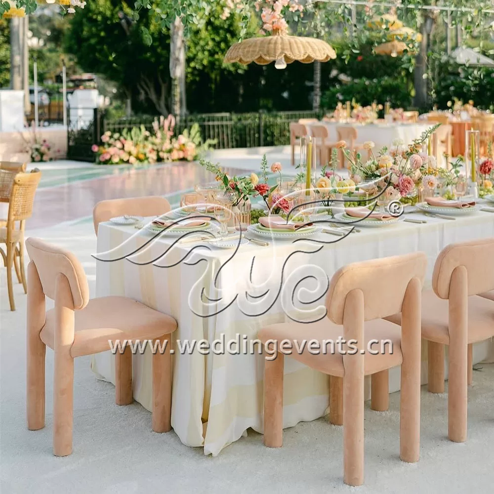
2. How Colors Affect Furniture Choices at a Wedding
Furniture is a priority in any setting; it is part of your visual story.
- Neutral Bases: Interest in white, cream, or beige pieces.
- Accent Colors: Say it differently with cushions, drapes, or overlays full of colour.
- Material Matching: Wooden chairs for a rustic theme; velvet lounges for a glam affair.
Browse hundreds of style-matching options at www.weddingevents.cn, where elegance meets affordability.
3. Coordination Between Bridesmaid Dress and Decor
One common mistake is choosing the bridesmaid dresses before considering the decor. Some details should be in unison to uplift the visual experience.
- Fabric needs to blend in with the table runners or the bouquets.
- There should be a common thread–either the same color family or a tone.
- Or maybe add hush touches such as sashes or flower packs to bridge that gap.
4. Color and Florals
Florals are infinitely varied, yet they need taming.
- Focus on 2-3 main flower colors.
- Let the greens tone down the brightness.
- Match the tones of the flowers to the linens on the tables and the vases for the centerpieces.
5. The Psychology Behind Color Choices
Color triggers subconscious reactions:
| Color | Meaning |
|---|---|
| Pink | Romance, sweetness |
| Blue | Peace, trust |
| Red | Passion, celebration |
| Gold | Luxury, elegance |
| Green | Growth, harmony |
Knowing this helps you decide the overall emotional tone of your wedding day.
6. Wedding Stationery: From Itsies to Thank-You Cards
Invitations offer the first glance at the wedding theme. Be consistent with its palette:
- The same colors must be used in menus, programs, and thank-you cards.
- Consider designs, borders, and calligraphy that resonate with the style.
- For upscale themes, opt for foiled accents in gold or silver.
7. Designing with Colors for the Reception
This is where your colors come to life.
Tips:
- Alternate linen and napkin colors for interest.
- Use lighting techniques to ‘play’ with the colors as they shift from sunset to moonrise.
- Build an Accent with candles, LED uplighting, and flower runners.
Check out their website www.weddingevents.cn for furniture sets of all colors, ranging from boho to ballroom.
8. Wedding Cake & Dessert Tables Are a Scene One More Time
The dessert table is another opportunity for decoration. Coordinate cake colors and stands with your tablecloth, backdrop, and floral arrangements. Gold-eyed-tiered trays or clear acrylic panels will help the sweets stand out.
9. Color in Wedding Photography
Tell your photographer about the palette. This way, they will:
- Find locations that suit your scheme.
- Touch up colors in post.
- Make use of special filters and lighting that complement your choices.
10. Outdoor vs. Indoor Weddings and Their Color Use
Outdoor Weddings:
- Draw colors from nature.
- Include subtle pops that do not fight with the landscape.
Indoor Weddings:
- Go for hard-hit washes of color to charge the space.
- Layer their textures to keep visuals from becoming flat.
11. Creating a Mood Board Before You Start
Mood boards save time and avoid chaos. Combine:
-
Fabric swatches
-
Photos of furniture from www.weddingevents.cn
-
Floral arrangement inspirations
-
Stationery samples
12. Trending Color Combinations in 2025
-
Terracotta + Dusty Blue
-
Olive Green + Cream
-
Rose Gold + Navy
-
Lilac + Sage
-
Burnt Orange + Plum
Visit Wedding Events for items that match trending aesthetics perfectly.
Conclusion: Let Color Tell Your Love Story
Color is not just for beauty- it is a language of storytelling. Color coordination for wedding aesthetics is more than visual appeal; it adds emotion, creates an ambience, and spotlights your unique love. Your color story will unveil itself, however, you had planned- from the aisle to the afterparty- with the right pieces from www.weddingevents.cn.
If you want to know more about outdoor weddings, please click this: How to Deal With a Rainy Wedding Day?